Scoreboard Data Script
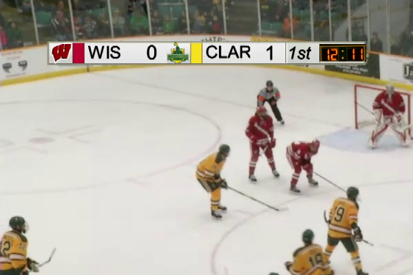
As part of Clarkson’s TV station’s move to ESPN+, we decided it was time to change how we showed the game clock on the broadcast. For the first year or so of our broadcasts on ESPN+, we had a static camera pointed at the scoreboard, which was then cropped and positioned to show the current time within the rest of our scorebug graphic. It’s a simple and effective method, especially when working in arenas you’re not familiar with. That said, any time the scoreboard moves, you have to re-crop and re-position the display, which is tedious work. To make matters worse, the media team liked to put a GoPro on the bottom of the scoreboard, which meant lowering the entire scoreboard every game.
The scorebug shown here was rendered by our Livestream HD550 switcher, which is an all-in-one production unit with switching, graphics, replays, clip playback, audio mixing, and streaming capabilities, all packed into a portable unit the size of a briefcase. While it’s extremely effective for smaller broadcasts, the added complexity of an ESPN+ broadcast means that the sole operator can quickly become overwhelmed, and there were a number of cases where the scorebug would display 1st even though we were five minutes into the second period. Being able to pull this data directly off the scoreboard would increase the accuracy of the data, as well as take one more task off the plate of the operator.
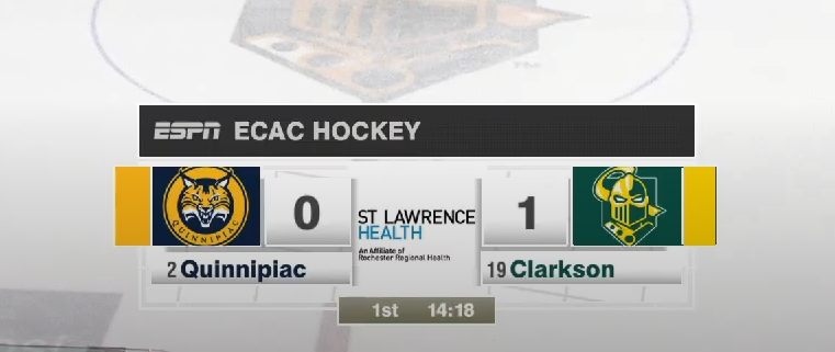
While we were working on a solution to this problem, we significantly upgraded our setup, moving to a Ross Graphite system with XPression graphics. This not only split up the responsibilities of the one operator of our last system, it also allowed for significantly more sophisticated data-driven graphics through Ross’ DataLinq utility. As long as I could get some sort of connection between the arena’s scoreboard and the computer that ran XPression, we could use all of that information in graphics as it updates live. No more needing to remember to change the score on both the scorebug and the lower third, every graphic links back to the same field, which in turn is updated by the data feed from the scoreboard.


The only remaining task was to actually get the data from the scoreboard to DataLinq. Our Fair-Play scoreboard was a wireless system, with a controller down in the timekeeper’s box connecting to the scoreboard over the ice and several clocks around the building. After asking around, we found a solution that involved a pair of expensive black boxes. The first has its own wireless receiver and pairs directly with the controller, which gets around the channel-switching security features that prevent a random guest from messing with the scoreboard during a game. It outputs data over a 9-pin connector to the second box, which decodes the signal from the first and sends it over to a computer on your network.
After buying the first black box, the guide that came with it said that 9-pin connector was outputting serial data at 9600 baud. I got a serial to USB cable and hooked it up, and started working on a Python script to interpret the serial data. Much to my surprise, the data was coming over as plain, unencrypted text. I spent some time playing around with the scoreboard controller, changing values on the scoreboard and seeing what changed in the serial output stream. I was pretty quickly able to create a script that interpreted the output and wrote the data to an XML file, which was then saved over the network and watched by DataLinq. This was just about exactly what I was looking for, but there were a few additional features I was looking for.
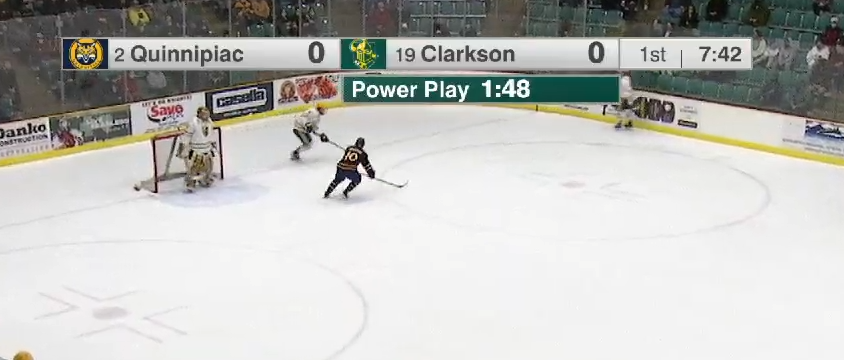
One of the most interesting data points that came over was the time remaining on each of the four penalty spots on the scoreboard. I wanted to incorporate the time remaining in a power play into our graphic, which already had a spot for that information. The issue was, with hundreds of possible combinations of penalty time locations, strengths, and any other manner of weird situations, I needed to come up with a foolproof way to determine what time to show on the graphic. After thinking about this problem for a bit, I realized that nothing would change until the next penalty expires, regardless of what team that player is on or what order they were penalized in. Within the Python script, I did some simple comparisons to get the lowest remaining penalty time, and created a field in the XML file that always returns that value. I then created variants of the power play graphic for each situation (power play, 5 on 3, 4 on 4), each using that time. If the game was in a 4 on 4, the time on the graphic would show the time until the first player is released. It would then immediately switch to the time until the other player was released, at which point the graphics operator would take down the 4 on 4 flag and put up the appropriate power play flag. Not only does it work well, it’s super resilient to weird situations and easy for the operators to figure out. I had thought of trying to automate showing and hiding the flags, but that looked like it would only open up more problems than it would solve.
Using the wireless receiver, I was able to create a Python script that accurately provides live score and time data to our graphics engine, allowing us to effortlessly create and use more advanced graphics with less effort on the part of our operators. This script has been used in just about every single game at Cheel ever since it was created, and it’s cool to know that something you created is such a critical component of something enjoyed by thousands of hockey fans.
